Ashley Levy
Former special education teacher turned data analyst with a passion for leveraging data to optimize performance, skilled in R, SQL, and Tableau.
I am actively seeking remote or hybrid job opportunities in the Metro Atlanta area to apply my skills and contribute to organizations in a flexible work environment.
LinkedIn Profile
Train Derailment Dashbard Using Tableau
Following the derailment that occurred in East Palestine, Ohio on February 3, 2023, there has been a notable surge in news coverage regarding train derailments. This has prompted me to ask the question: Has there been an actual increase in train derailments or is the media simply more inclined to report on them due to the recent catastrophe in East Palestine?
1. Finding Data
The Federal Railroad Administration curates a comprehensive database of rail equipment incidents and accidents, which is sourced from the Form 54 submissions. The Form 54 is a federal report that rail companies submit to report any incidents or accidents. As of March 2023, the database encompasses information spanning from 1975 to 2022.
2. Planning the Dashboard
In the initial mockups that I designed, my intention was to utilize both a map and stacked line chart to effectively present the data. However, upon creating the stacked line chart, I noticed that certain data points were unclear due to scaling issues. Consequently, I realized the need to explore alternative visualizations that could better represent the data and convey its intended message with clarity.
3. Final Dashboard
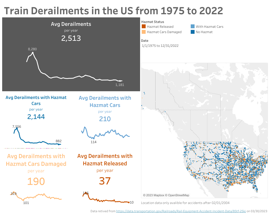
Ultimately, I decided to utilize scorecards with sparklines to effectively showcase the trends in the number of train derailments.
Creating a Custom Calculated Field
In order to analyze the derailments based on the presence of hazardous materials, I created a custom calculated field:
IF
[Hazmat Released Cars] > 0 THEN 'Hazmat Released'
ELSEIF [Hazmat Cars Damaged] > 0 THEN 'Hazmat Cars Damaged'
ELSEIF [Hazmat Cars] > 0 THEN 'With Hazmat Cars'
ELSE 'No Hazmat'
END
Creating the Map
To create the density map, I utilized the geospatial data from the database, which provided the latitude and longitude of each incident starting from 2004. The color was assigned according to the calculated field, hazmat status. I also added a data filter to allow users to adjust the view for a specific date range.
Creating the Sparkline Scorecards
To generate the sparkline scorecards, I created a line graph and removed the axes and gridlines. The minimum and maximum values were labeled to provide a reference for the absolute number of derailments. Additionally, the colors were selected to match the filters on the map, creating a more cohesive dashboard that enables viewers to easily make associations between the data.
Dashboard

4. Further Questions
- What happened after 1978 to create such a sharp decline in derailments?
- Is there any available data on the environmental impact caused by each of the derailments that released hazardous materials? Are there any agencies tracking this information?